10 Uber Eats Video Ideas for TikTok, Reels and Shorts
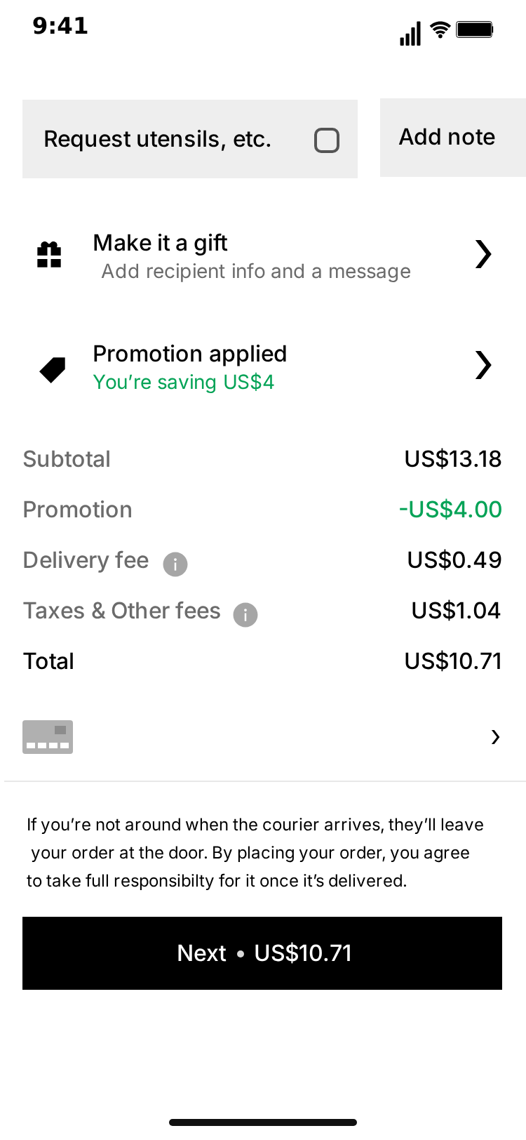
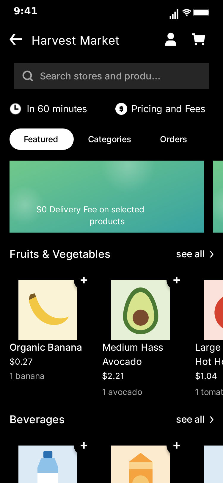
Food delivery is a shared experience, which makes it easy material. Everyone knows what it feels like to watch a cheap meal turn expensive at checkout. MockClip's Uber Eats template gives you a home page, a store and a checkout to build those moments on, with every name and price yours to write.
Each idea below says which screen carries the joke, what to type and how to script it. The values are examples, so change them to suit your own humour. For the full walkthrough of the editor, see how to make a fake Uber Eats video.
MockClip is not affiliated with or endorsed by Uber. These are mockups for skits, demos and creative work, so invent your restaurants and don't pass a fake order off as real.
A note on what the template can do, so the ideas stay honest. It has three screens: Home, Store and Checkout. A script can only scroll and pause, so nothing gets added to a basket during the video. Each idea here ends at or before the checkout, and any other story, such as what happens when the food arrives, goes in your own edit.
Checkout jokes
The checkout's fields are plain text, so the numbers never have to add up. The page scrolls as one piece, with the delivery options at the top and the price breakdown and button at the bottom. That makes it a natural reveal: the viewer gets the totals last.
One thing to plan around: the description line under the item is fixed and always lists wings, celery and a dip. An item title with "box" in it sits happily above that line.
1. The fee bigger than the meal
The classic. A small order with a delivery fee that dwarfs it.
- Item. Item Title
Crispy Chicken Box, Item PriceUS$3.20. - Prices. Subtotal
US$3.20, Promotion-US$0.00, Delivery FeeUS$48.00, TaxesUS$0.80, TotalUS$52.00. - Button. Pay Label
Next US$52.00. - Script. Scroll to Total, smooth, 3 seconds. Pause 2 seconds.
- Flow. Checkout only, about 7 seconds.
The sum is correct, which is the cruel part. A slow scroll lets the viewer see the small item price first, so the fee has something to be compared with.
2. The savings that saved nothing
A proud green line next to a painful total.
- Savings.
You're saving US$0.04 - Prices. Subtotal
US$38.00, Promotion-US$0.04, Delivery FeeUS$6.99, TaxesUS$9.05, TotalUS$54.00. - Script. Scroll to Total, smooth, 2 seconds. Pause 2.5 seconds.
- Flow. Checkout only, about 6 seconds.
Savings and Total are on screen together at the bottom of the page, so the contrast does the work with no caption at all.
3. Payday versus the day before
Two exports with the same layout, cut together.
- Clip one. Item Title
Deluxe Family Box, Item PriceUS$64.00, SubtotalUS$64.00, Promotion-US$0.00, Delivery FeeUS$3.99, TaxesUS$7.01, TotalUS$75.00. - Clip two. Item Title
Smallest Box Available, Item PriceUS$4.99, SubtotalUS$4.99, Promotion-US$4.99, Delivery FeeUS$0.00, TaxesUS$0.00, TotalUS$0.00, SavingsYou're saving your last US$4.99. - Script, both. Scroll to Total, smooth, 2 seconds. Pause 1.5 seconds.
- Flow. Checkout only in both, about 5 seconds each.
Use a hard cut between them. The second clip lands because the layout is identical and only the item and the numbers have changed.
Late-night and relatable
These work because the viewer has done it too. Switch to the dark theme for all three.
4. The 3am browse
A long scroll past everything, ending where it always ends.
- Home. Location
My Bed, which reads as "Now" followed by your text. - Home script. Scroll to Fresh groceries, linear, 8 seconds. Pause 1 second.
- Checkout. Item Title
The Usual, with a total of your choice. - Checkout script. Scroll to Your items, smooth, 1 second. Pause 2.5 seconds.
- Flow. Home, push to Checkout, about 16 seconds.
Linear motion matters here: it keeps the page moving at a steady, slightly hopeless pace. The Usual sits above the fixed line about wings, which reads as exactly what this person always gets. There is no touch indicator on a move straight from Home to Checkout, so it plays as a plain push.
5. The "just looking" scroll
Script the home page to go down, stop, come back and go again.
- Home script. Scroll to Popular near you, smooth, 1.5 seconds. Pause 1 second. Scroll to top, smooth, 1 second. Pause 1 second. Scroll to Today's offers, fling, 1.5 seconds. Pause 1 second. Scroll to top, smooth, 1 second.
- Restaurants. The default list is fine, because this idea is about the motion, not the names.
- Flow. Home only, about 12 seconds.
Add a caption in your edit about opening the app with no intention of ordering. The return to the top is the punchline, so make the final scroll a little quicker than the others if you want it to feel like giving up.
6. The healthy-eating arc
Let the fixed line on the checkout deliver the punchline for you.
- Store script. Pause 1.5 seconds, so the fruit and vegetables are on screen. Then scroll to the bottom with a fling, 1 second.
- Checkout. Item Title
Healthy Salad. - Checkout script. Scroll to Your items, smooth, 1 second. Pause 3 seconds.
- Flow. Store, push to Checkout, about 10 seconds.
Under Healthy Salad the page lists six wings, a side of celery and a dip. Hold long enough for the viewer to read it, because that small grey line is the whole joke. Touch indicators show a tap on the basket icon before the checkout appears, which helps it read as a decision.
Characters and worlds
The restaurant names are the punchline here. Keep the fees line in its usual shape, with four spaces in the middle, because a small dot sits in that gap.
7. A whole street of fictional restaurants
Fill the list with places from your own universe, whether that is a game, a book or an inside joke with your audience.
- Restaurants. For a fantasy setting:
The Gilded Goblin,Potion & Pastry,Dragon Breath BBQ,Second Breakfast Inn. - Fees.
$0.29 Delivery Fee 2-3 moons - Featured. Your eight oddest names, since these cards are smaller and reward a closer look. The second card of each pair is cut by the edge of the screen.
- Home script. Scroll to Latest stories, linear, 12 seconds. Pause 1 second.
- Flow. Home only, about 15 seconds.
The 24 slots give you room to reward people who pause the video. Fixed sections such as the grocery rows sit between the restaurants, so a long scroll passes ordinary content too. That ordinariness helps: the strange names stand out more against it.
8. Your friend group as restaurants
Name each restaurant after a friend, with their permission, and give each one a rating and a delivery time that match their personality.
- Always late.
Sam's Kitchen,$0.29 Delivery Fee 90-120 min,3.2 - Never replies.
Priya's Place,$0.29 Delivery Fee Closed,4.9 - Always available.
Jo's Diner,$0.29 Delivery Fee 1-2 min,5.0 - Home script. Scroll a distance of
700, smooth, 2 seconds. Pause 2 seconds. - Flow. Home only, about 6 seconds.
Restaurants 1 and 2 sit near the top of the page, with the promo card under them and restaurant 3 below that, so a short scroll passes all three. Put the best joke in the third slot, where the scroll comes to rest.
Business and demos
Not every clip has to be a joke.
9. A local restaurant promo
Show what your own place could look like in a delivery app, for a post on your own channels.
- Restaurants. Your name in slots 1 and 4 with your best photo, and invented neighbours in the slots between. The tap into the store lands on slot 4. Use your real delivery time in the fees line if you offer delivery.
- Rating. Leave it blank. Don't invent one. The number goes, and the small grey badge stays empty.
- Store. Title is your name, the three aisle headings are your menu sections and the products are your real dishes and prices.
- Store script. Scroll a distance of
300, smooth, 1.5 seconds. Pause 1.5 seconds. - Flow. Home with its default script, push to Store, about 11 seconds.
Say clearly that it is a mockup, not a real listing, and don't suggest you are on a platform if you are not. Use only offers you really run. The lower aisle headings on the store can't be changed and may not suit a restaurant, which is why the store's scroll here is short: it stops before they come into view.
This template recreates a design that belongs to its owner, and MockClip's licence gives no rights in it. For paid ads or work for a client, the terms say to use a brand-free app such as Text Chat. The pricing page has the details of each plan.
10. A design or course demo
Teaching app design, pricing psychology or how fees are shown? Use a familiar ordering flow as your example, and change the numbers to make your point.
- Clip one. A checkout with Subtotal
US$20.00, Delivery FeeUS$0.00, TaxesUS$9.00, TotalUS$29.00. - Clip two. Subtotal
US$27.00, Delivery FeeUS$0.00, TaxesUS$2.00, TotalUS$29.00. - Script, both. Scroll to Total, smooth, 2 seconds. Pause 3 seconds.
- Flow. Checkout only, about 7 seconds each.
Both clips cost the same, so the discussion is about how the price is split. Because every price is a text field, you can test a change in seconds rather than asking someone to redraw the screen. For anything shown publicly, say that it is a mockup and not the real app.
Which screens each idea needs
Before you open the editor, decide which screens the clip uses. It saves filling in fields that never appear.
| Idea | Home | Store | Checkout | What carries it |
|---|---|---|---|---|
| 1. Fee bigger than the meal | No | No | Yes | The Delivery Fee field |
| 2. Savings that saved nothing | No | No | Yes | Savings next to Total |
| 3. Payday versus the day before | No | No | Yes (twice) | The hard cut between clips |
| 4. The 3am browse | Yes | No | Yes | The long scroll and Location |
| 5. "Just looking" scroll | Yes | No | No | The script alone |
| 6. Healthy-eating arc | No | Yes | Yes | The fixed line under the item |
| 7. Fictional restaurants | Yes | No | No | Restaurant and featured titles |
| 8. Friends as restaurants | Yes | No | No | Titles, ratings and times |
| 9. Local restaurant promo | Yes | Yes | No | Your photos and your menu |
| 10. Design or course demo | No | No | Yes (twice) | One split changed between exports |
Seven of the ten need only one screen. Remove the other steps from Video flow, and a screen with its own script is a finished clip.
Timing guide
A screen stays on for as long as its script runs, so the script sets the pace. The editor adds a short wait before the first step and a smaller one between steps, and each screen ends with a little under a second of stillness. To hold longer, add a Pause. These are starting points, not rules.
- Before anything moves: leave the automatic wait. The viewer needs a moment to recognise the app, and the editor's 0.6 seconds covers it. You rarely need a Pause as the first step.
- A scroll to the punchline: 2 to 3 seconds. Slow enough to read the lines on the way past. A fast fling works when the point is the motion, not the text.
- On the line that matters: 2 seconds or more. A total, a fee or a strange name needs time to be read and then understood.
- On the last screen: the longest hold in the clip. A clip that cuts away as the point arrives feels rushed. It also gives your edit a place to hold a caption.
Watch the clip back with the sound off, once, without reading along. If you find yourself wanting to pause it, it needs a longer hold. If your attention drifts, cut a step.
Captions that help
The screen shows what happened, and the caption can say why it matters. The two should not repeat each other. A caption that says "me ordering at 3am" over a dark home page is doing the screen's job. "I said one more episode" adds something, because the viewer connects the two themselves.
The checkout jokes often need no words at all. If you do add one, keep it above the numbers rather than over them, and put it on in your video editor after export.
For local businesses it runs the other way: the caption should be plain. Say what the offer is, where you are and when it ends, and say that the video is a concept. People can scroll past a joke without losing anything, but they need these facts to act, and a clip that looks like an app can leave them unsure what is real.
Tips that help every idea
- Put the joke where the page stops. Viewers read what holds still, so end a scroll on the line that matters.
- One detail per clip. The strongest of these change a single thing on an ordinary screen. If everything is a joke, nothing stands out.
- Keep names short. Cards have fixed slots and long names can run past them.
- Use the dark theme for late-night clips. It sells the mood at no extra effort.
- Try Describe it for a first draft. If you have an account, a one-sentence idea becomes a clip you can adjust, and the guide to Describe it shows how to phrase one.
Common mistakes
A few things go wrong often enough to check for before you export.
- Scrolling to the wrong place on the checkout. Your items stops before the total comes into view. For a price joke, scroll to Total.
- Changing Total but not Pay Label. They are separate fields, so the button keeps its old price unless you change it too.
- Expecting a heading to change. Only the store's first three aisle headings are fields. The other headings on the store and all of those on the home page are fixed.
- Hiding a name in the third column. Product cards in the third column are cut by the edge of the screen and rows don't scroll sideways.
- A store that doesn't match the card. The store shows what you typed on its own tab, so copy the restaurant's name across.
- Forgetting the list repeats. A short list fills all the slots by repeating, so a long scroll shows your jokes again.
Pair it with a chat
Since the template stops at the checkout, a chat is a natural next beat. A clip of a checkout followed by a message ("are you seriously ordering again") tells a whole story in a few seconds. The brand-free Text Chat template works for that, and the prompt ideas post has more starting points for the conversation side.
Pick one idea, open the Uber Eats template and build it. The manual editor works without an account, and exports come out as MP4 or GIF, with a watermark on free exports that paid plans remove.
Free to use. No sign-up. Browser-based.
Make a fake Uber Eats videoFrequently Asked Questions
What makes a good Uber Eats video?
One clear joke that lands on a single screen. The checkout is usually the best place for it, because the viewer reads the numbers as the page scrolls to the total.
How long should the clip be?
Most of these work best short. Trim the scroll steps so the video reaches the punchline quickly, and hold the last screen long enough to read.
Can I use a real restaurant's name?
Invent one. Using a real business in a joke can mislead viewers, and an invented name is often funnier anyway.
Can a restaurant use this to promote itself?
On its own channels, as a mockup of what the place could look like, and it should be presented as one. Don't suggest you are listed somewhere you are not, and don't invent a rating. For paid ads and client work, use a brand-free app instead.
Can these videos show the order being tracked?
No. The template covers the home page, a store and the checkout, so these ideas all end at or before the checkout.
Related Articles
How to Make a Fake Uber Eats Video (Free, in Browser)
Step-by-step: build a fake Uber Eats video in your browser, with a home page that scrolls, a store full of products and an editable checkout. Exports MP4.
AI Fake Chat Video Generator: Describe It, Get the Clip
Type what the clip should be and MockClip's Describe it mode writes the messages and timing for WhatsApp, iMessage, ChatGPT, Tinder and more. Refine by second.