How to Make a Fake Uber Eats Video (Free, in Browser)
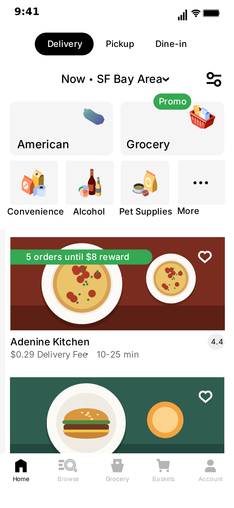
MockClip's Uber Eats template turns restaurants and prices you write into an animated phone screen that looks like a food ordering app. The video scrolls a long home page, taps into a store, scrolls its aisles, and ends on a checkout whose totals say whatever you want them to say. You export the result as an MP4 or a GIF.
This guide walks through the whole process, from the editor's default clip to an exported video, with a complete worked example, a timing guide and a troubleshooting list. At the end there is a section on what the template does not do, so you can plan around it before you start writing.
Every word and every photo in the clip is yours. Nothing is read from or sent to Uber, and MockClip is not affiliated with or endorsed by Uber Technologies, Inc. The screens follow a community design kit of the app, not every detail of the current one. Use invented restaurant names, and keep the clip to skits, demos and creative work: don't pass a fake order, price or receipt off as real.
What the template draws
There are three screens, and each one is a full page that scrolls rather than a single screenful. The video is built by deciding how far each page scrolls and which pages appear.
- Home. A long page with a location line, category tiles, restaurant cards, smaller featured cards, promos and grocery rows. A header stays at the top and a bottom bar stays at the bottom while the page moves.
- Store. A store with a search bar, tabs and a promo banner, then rows of product cards under aisle headings. The header stays in place, and the search bar scrolls away with the page.
- Checkout. Delivery options at the top, then the item and a price breakdown further down, with a button at the very end. This page scrolls as one piece, so the button only appears once you reach the bottom.
The editor lists the parts you can change. Everything else on the page stays as drawn.
| Screen | What you edit | What stays as drawn |
|---|---|---|
| Home | Location, Promo Title, 24 restaurants (title, fees, rating, photo), 8 featured cards (title, fees, photo) | Category tiles, section headings, the grocery rows, the bottom bar |
| Store | Title, Eta, three aisle headings, 21 products (title, price, unit, photo) | Search bar, tabs, promo banner, the four lower aisle headings |
| Checkout | Address, Item Title, Item Price, Savings, Subtotal, Promotion, Delivery Fee, Taxes, Total, Pay Label | Delivery options, the item's description line, the suggested items, the labels beside the prices |
Read the last column before you write a joke. A clip that relies on renaming a category tile or a section heading won't work, and it is better to find that out now.
Step 1: Open the template and watch the default
Go to the Uber Eats template and press play. The default clip runs through all three screens in order and takes about 17 seconds:
- The home page scrolls down past the first restaurants.
- A tap on a restaurant card opens the store, which scrolls to its second aisle.
- A tap on the basket icon opens the checkout, which scrolls to the bottom.
Everything in that clip can be changed from the editor. The tabs at the top switch between the Home, Store and Checkout screens, and Video flow sets which of them appear and in what order. The fields are already filled with examples, so you can overwrite what you need and leave the rest.
Step 2: Write the restaurants
On the Home tab you set the location, the promo title and the restaurant list. Each restaurant has these fields.
- Title: the name on the card. Invent one, and keep it short.
- Fees: the line under the name, such as
$0.29 Delivery Fee 10-25 min, with four spaces in the middle. - Rating: the number in the small grey badge on the card, such as
4.4. - Photo: an image you upload. The default clip uses neutral food illustrations.
The home page has 24 restaurant slots and 8 smaller featured cards, which have a title, a fees line and a photo but no rating field. You don't need to fill them all. A shorter list repeats down the page, so three good restaurants are enough for a short clip that never scrolls far.
The order of your list matters, because the slots are spread down the page. Restaurants 1 and 2 sit under the category tiles, the promo card comes next, and restaurants 3 to 5 follow it. The featured cards appear in pairs further down, and the second card of each pair is cut by the right edge of the screen, so put the one you care about first.
Two more fields finish the page.
- Location: the line in the header, after the fixed word "Now". It stays on screen for the whole of Home, so it is a good place for a small joke.
- Promo Title: the headline on the promo card under the second restaurant. The default runs over two lines. The box in the editor is a single line, so a title you retype sits on one line and should stay short.
If your clip goes on to the store, look at the fourth restaurant. That is the card the touch indicator lands on when the video moves to the store. With a three-restaurant list the fourth slot repeats your first restaurant, so your first entry is the one that appears to be opened.
Step 3: Stock the store
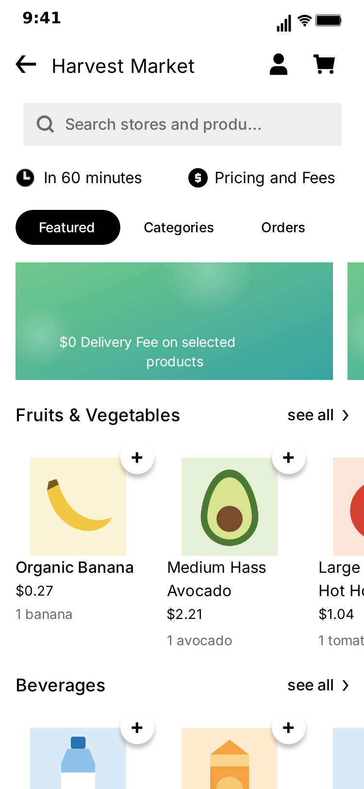
On the Store tab you set the store's name, the delivery time and three aisle headings, then the products.
- Title: the store's name in the header. Harvest Market in the default.
- Eta: the line under the search bar, such as
In 60 minutes. - Aisle1, Aisle2, Aisle3: the first three headings.
- Products: each one has a title, a price such as
$0.27, a unit such as1 banana, and a photo.
The store has 21 product slots laid out three to a row, so there are seven rows. Only the first three rows have headings you can edit.
| Row | Heading | Can you edit it? | Product slots |
|---|---|---|---|
| 1 | Aisle1 (Fruits & Vegetables in the default) | Yes | 1 to 3 |
| 2 | Aisle2 (Beverages in the default) | Yes | 4 to 6 |
| 3 | Aisle3 (Frozen Foods in the default) | Yes | 7 to 9 |
| 4 | Pantry & Groceries | No | 10 to 12 |
| 5 | Pantry & Groceries | No | 13 to 15 |
| 6 | Meat, Seafood & Plant-Based | No | 16 to 18 |
| 7 | Cheese | No | 19 to 21 |
The third column runs off the right edge of the phone, so put the products that matter in the first two. The rows don't scroll sideways, which means a product in the third column is never fully seen.
Keep titles short. The default titles are split over two or three lines, but the title box in the editor is a single line, so a title you retype sits on one line. About 16 characters fits inside a card. The price and unit stay where the design put them, so a one-line title in a slot designed for three lines leaves a gap above the price.
The store does not follow the tap. Whatever restaurant the video appears to open, the page shows what you typed on the Store tab, so copy the restaurant's name into Title if you want them to match.
Step 4: Set the checkout
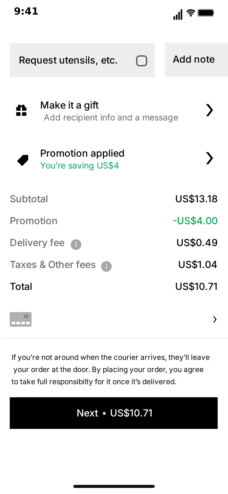
The Checkout tab is where most jokes land. You can change the address, the item and its price, the savings line, the subtotal, the promotion, the delivery fee, the taxes, the total and the label on the button.
These are plain text fields, and nothing adds them up for you. A delivery fee of US$48.00 on a small order is fine. So is a total that makes no sense at all, if that is the point. If you want the numbers to look right, do the sum yourself and type the result into both Total and Pay Label, because those two fields don't follow each other either.
A few details are worth knowing before you write.
- Address sits above a fixed "CA" line.
- Item Title appears twice: on the item, and again on the first suggested item below it.
- Item Price also appears twice, once on each line of the item.
- The item's description is fixed. Under Item Title the page always reads "6 Wings", "Side of Celery" and "Ranch Dip". A title like
Crispy Chicken Boxsits naturally above it. A title likeGreen Saladturns it into a joke, which can be useful. - Savings is the green line under "Promotion applied". The whole line is yours, so write it as a sentence:
You're saving US$0.04. - Pay Label is the text on the button at the end of the page, such as
Next US$10.71. A small dot sits in the gap, so keep the first word short and leave the five spaces.
Step 5: Decide how each screen scrolls
Every screen has its own short script under "How this screen scrolls". There are two kinds of step:
- Scroll: to a named section of the page, to the top or bottom, or by a distance you type.
- Pause: hold still for as long as you want.
Each scroll step also has a motion and a duration, so a slow browse and a quick fling are both possible. The motions are smooth, fling, ease out and linear. Linear suits a long, steady browse, and fling starts fast and slows down the way a flick of the thumb does.
The named sections are fixed points on each page.
| Screen | Named section | What you land on |
|---|---|---|
| Home | Categories | The tiles, then restaurants 1 and 2 |
| Home | Popular near you | Featured cards 1 and 2, then restaurants 6 to 10 |
| Home | Today's offers | Featured cards 3 and 4, then restaurants 11 to 13 |
| Home | Fresh groceries | The fixed grocery rows, then restaurants 19 and 20 |
| Home | Latest stories | The fixed stories row, then restaurants 21 to 24 |
| Home | Footer | The end of the page |
| Store | Deals | The promo banner, then aisle row 1 |
| Store | Beverages | Aisle row 2 |
| Store | Pantry | Aisle row 4 |
| Store | Cheese | The end of the page |
| Checkout | Delivery options | The delivery choices |
| Checkout | Your items | The item and the suggested items |
| Checkout | Total | The end of the page, with the price breakdown and the button |
These names don't change when you rename an aisle. If Aisle2 says Sides, the step that goes there is still called Beverages in the list.
A distance is measured from the top of the page, not from where the last step stopped. Two steps of 500 don't add up to 1,000: the second one stays where the first one ended. The default home page script uses a distance of 1050, which brings the fourth restaurant to the middle of the screen, ready for the tap.
Step 6: Arrange the video flow
Video flow lists the screens in order with the transition into each one. You can remove a step, move it up or down, or add another. The usual shape is Home, a push to Store, then a push to Checkout, but a clip about prices can be Checkout alone, and a clip about restaurant names can be Home alone.
A screen stays on for as long as its script runs. There is no separate hold time to set, so to keep a screen on longer, add a Pause step at the end of its script. A screen with no steps at all passes in under a second.
The Show taps box controls the touch indicators, which show where the tap lands before the move to the next screen. They make the change of screen feel like a person using an app. You can turn them off if you prefer a clean cut.
Step 7: Choose a theme and export
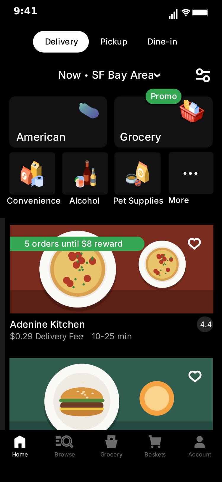
Pick the light or dark theme. Both cover all three screens, and dark tends to suit a late-night clip.
Then choose a format: vertical 9:16, or a 1:1 square for feed posts. Export as MP4 or GIF. Free exports carry a watermark, which paid plans remove.
A worked example from start to finish
Here is a complete clip with every value filled in, so you can see how the fields fit together. The story is a small order that gets expensive at the last moment.
Home tab
- Location:
Flat 3 - Promo Title:
Order now, regret later - Restaurant 1:
Nearly Chicken,$0.29 Delivery Fee 10-25 min,4.4 - Restaurant 2:
Second Dinner,$0.29 Delivery Fee 20-35 min,4.1 - Restaurant 3:
Late Noodles,$0.35 Delivery Fee 30-45 min,4.3 - Script: Scroll a distance of
1050, smooth, 2 seconds. Pause 0.5 seconds.
Restaurant 1 repeats into the fourth slot, so the tap lands on Nearly Chicken.
Store tab
- Title:
Nearly Chicken - Eta:
In 90 minutes - Aisle1:
Boxes, Aisle2:Sides, Aisle3:Regrets - Product 1:
Small Box,$9.00,6 pieces - Product 2:
One Olive,$2.50,1 olive - Product 3:
Extra Dip,$3.00,1 tub - Script: Scroll to Beverages (which now shows
Sides), smooth, 1.5 seconds. Pause 0.5 seconds.
Checkout tab
| Field | Value |
|---|---|
| Address | Flat 3, Invented Road |
| Item Title | Chicken Box |
| Item Price | US$9.00 |
| Savings | You're saving US$0.04 |
| Subtotal | US$9.00 |
| Promotion | -US$0.04 |
| Delivery Fee | US$48.00 |
| Taxes | US$6.50 |
| Total | US$63.46 |
| Pay Label | Next US$63.46 |
Script: Scroll to Total, smooth, 2.5 seconds. Pause 2.5 seconds.
The numbers add up on purpose here, because a correct sum makes the fee look worse. Leave Video flow on Home, Store, Checkout, keep Show taps on, and the clip runs for about 15.5 seconds. Most of that time goes on the checkout, which is where the joke is.
Plan the timing
The length of a clip comes from its scripts, so it can be worked out before you press play. These are the values the editor uses when you leave the timing fields empty.
| What | Time added |
|---|---|
| Before the first step of a screen | 0.6 seconds |
| Between two steps | 0.35 seconds |
| A scroll with no duration set | 0.9 seconds (0.7 for a fling) |
| A pause with no duration set | 1 second |
| At the end of each screen | 0.8 seconds |
| A push to the next screen | 0.35 seconds |
Each step also has a "Wait before" field that replaces the automatic gap in front of it. Set it to 0 when you want one movement to follow straight on from another.
The default clip's scripts all open with a short pause. Because of the 0.6 seconds that come first anyway, a pause at the start of a script is often more than you need. Removing it from each screen saves close to a second per screen, and the clip still gives the viewer a moment to recognise the page.
Give the last screen the longest hold. The final numbers are what the viewer came for, and a clip that ends as the total arrives feels rushed. Two seconds or more on the Total is a good starting point, then watch it once with the sound off and adjust. If you want to stop the video to read it, the hold is too short.
Add captions in your edit
The template gives you the screen. Captions, music and any voiceover go in your video editor after export. Keep the caption from repeating what the screen already shows. "Me ordering food" adds nothing over a clip of someone ordering food, while "I only wanted a snack" gives the viewer something to compare with the total.
For a mockup of your own business the caption has a different job: it should say plainly that this is a concept. A line such as "concept video, this is not a real listing" removes any doubt.
Use Describe it for a first draft
If you have an account, write a sentence such as "ordering dinner and hitting a delivery fee bigger than the meal" in Describe it, the AI panel in the editor. It drafts the restaurants, products, totals and scroll steps for you to adjust in the same editor. It doesn't create photos, so the images are still yours to upload. The guide to Describe it covers how to get good results from it.
For ideas on what to film, see Uber Eats video ideas.
Troubleshooting
A few things go wrong often enough to be worth a list.
- The same restaurant appears again further down. That is the short list repeating. Add more entries, or stop the scroll before the repeats begin.
- The touch indicator is at the edge of the screen. The tap into the store aims for the fourth restaurant. If the Home script ends with that card out of view, the indicator stays at the edge of the visible page. End the script near a distance of
1050, or turn Show taps off. - A stray dot in the fees line. The small dot between the fee and the time is drawn at a fixed spot on the card. It only sits in the gap when the text before it is about as long as
$0.29 Delivery Fee. Use a value of the same length, such as$9.99 Delivery Fee. - A name runs into something else. Cards don't reflow, so a long title can run past its space. Shorten it. In the store, about 16 characters is the limit before a title reaches the next card.
- A big number reaches the edge of the screen. Prices on the checkout start at a fixed point and grow to the right, so a value much longer than
US$100.00can be cut. - The rating badge is empty. A blank Rating removes the number, and the grey badge stays on the card.
- The checkout ends before the button. The button is the last thing on the page. Scroll to Total or to the bottom, not to Your items.
- A heading didn't change. Only the first three aisle headings on the store are fields. The section headings on the home page are fixed.
- The item description doesn't match the item. That line is fixed. Pick an Item Title that works with it, or use the mismatch as the joke.
- A screen flashes past. Its script is empty or very short. Add a Pause.
What the template does not do
It is better to know these before you plan a clip around them.
- No add-to-basket step. Products don't get added during the video, and the basket doesn't change. The plus buttons on the product cards and the hearts on the restaurant cards are part of the drawing.
- No menu or item pages. The screens are the home page, a store and the checkout.
- No payment or order confirmation. The clip ends at the checkout.
- No order tracking. There is no map, courier or confirmation screen.
- No sideways scrolling. Rows that run off the right edge stay where they are, and only the page moves.
- Only Scroll and Pause. A script can't type, tap a card or change a value partway through.
- Fixed slots. Cards don't reflow, so very long names can run past their space.
- No connection to Uber. Nothing comes from the real app, and nothing here says anything about real restaurants.
If your idea needs a conversation, such as an argument about who ordered what, the brand-free Text Chat template can do that part, and you can cut the two clips together in your video editor.
Using it responsibly
A clip that looks like an app can be mistaken for a real screenshot, so a few habits are worth keeping. Use invented restaurants rather than real ones, since a made-up rating or price on a real business is unfair to it. Don't use the clip to claim an order, a refund or a charge that never happened.
The template recreates a design that belongs to its owner, and MockClip's licence gives no rights in it. It suits your own content, including posts on your own channels. For paid ads and client work, the pricing page explains the plans, and the terms say to use a brand-free app.
Please keep it honest. Use the template for skits, demos and mockups, and don't pass a fake order, price or receipt off as real.
Free to use. No sign-up. Browser-based.
Make a fake Uber Eats videoFrequently Asked Questions
How do I make a fake Uber Eats video?
Open MockClip's Uber Eats template, write your restaurants, stock the store with products, set the checkout's prices, adjust how each screen scrolls, then export as MP4 or GIF. The manual editor works without an account.
Is this connected to Uber Eats?
No. Every restaurant, price and photo is something you type or upload in the editor. Nothing is read from or sent to Uber, and MockClip is not affiliated with or endorsed by Uber Technologies, Inc.
Can the video add items to the basket or track the order?
No. The template is a walkthrough of three screens: the home page, a store and the checkout. There is no add-to-basket step, no payment, no order confirmation and no live tracking screen.
What happens if I add fewer restaurants than the page has?
The page has a fixed number of slots, so a shorter list repeats to fill them. Rows past the last slot are left out, and very long names can run past their card, so keep names short.
Which text can't I change?
Only the fields the editor lists are yours: the restaurants, featured cards, location and promo title, the store's name, delivery time, three aisle headings and products, and the checkout's address, item, prices and button label. Other text on those pages is fixed, including the description line under the checkout item.
Do the checkout totals add up by themselves?
No. Every price on the checkout is plain text, so nothing is calculated. If you want the sums to be right, work them out yourself. If the joke is that they are wrong, type whatever you like.
Can I use my own photos?
Yes. Each restaurant, featured card and product has a photo upload. Without an upload the default clip shows neutral food illustrations.
Do I need an account?
Not for the manual editor. Describe it, the AI panel that drafts a clip from one sentence, needs a sign-in to MockClip.
Which formats can I export?
MP4 or GIF. Free exports carry a watermark, which paid plans remove.
Related Articles
10 Uber Eats Video Ideas for TikTok, Reels and Shorts
Ten fake Uber Eats video ideas you can build in a browser: delivery fee jokes, late-night orders, restaurant promos and app demos, with how to set up each one.
AI Fake Chat Video Generator: Describe It, Get the Clip
Type what the clip should be and MockClip's Describe it mode writes the messages and timing for WhatsApp, iMessage, ChatGPT, Tinder and more. Refine by second.