10 Food Delivery Video Ideas With a Fake DoorDash Screen
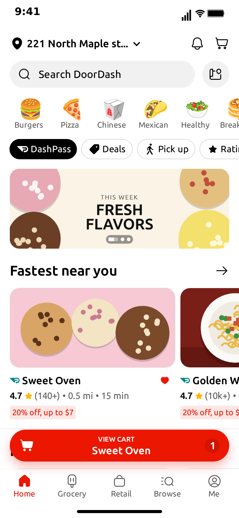
A delivery app is one of the most familiar screens on anyone's phone. Everybody knows what a 4.9 rating feels like, what a 15 minute estimate promises, and how a cart with one item looks at 2am. That familiarity is what makes it good material: you change one detail and the viewer gets it before you say a word.
Here are ten ideas you can build with MockClip's DoorDash template, with what to type for each. They are grouped by who they suit: skits first, then local businesses, then demos. If you have not used the template yet, the step-by-step guide covers every field.
All of them use invented stores. The template is not connected to DoorDash, MockClip is not affiliated with DoorDash, Inc., and a clip should never be used to pass off a fake order or a fake store as real.
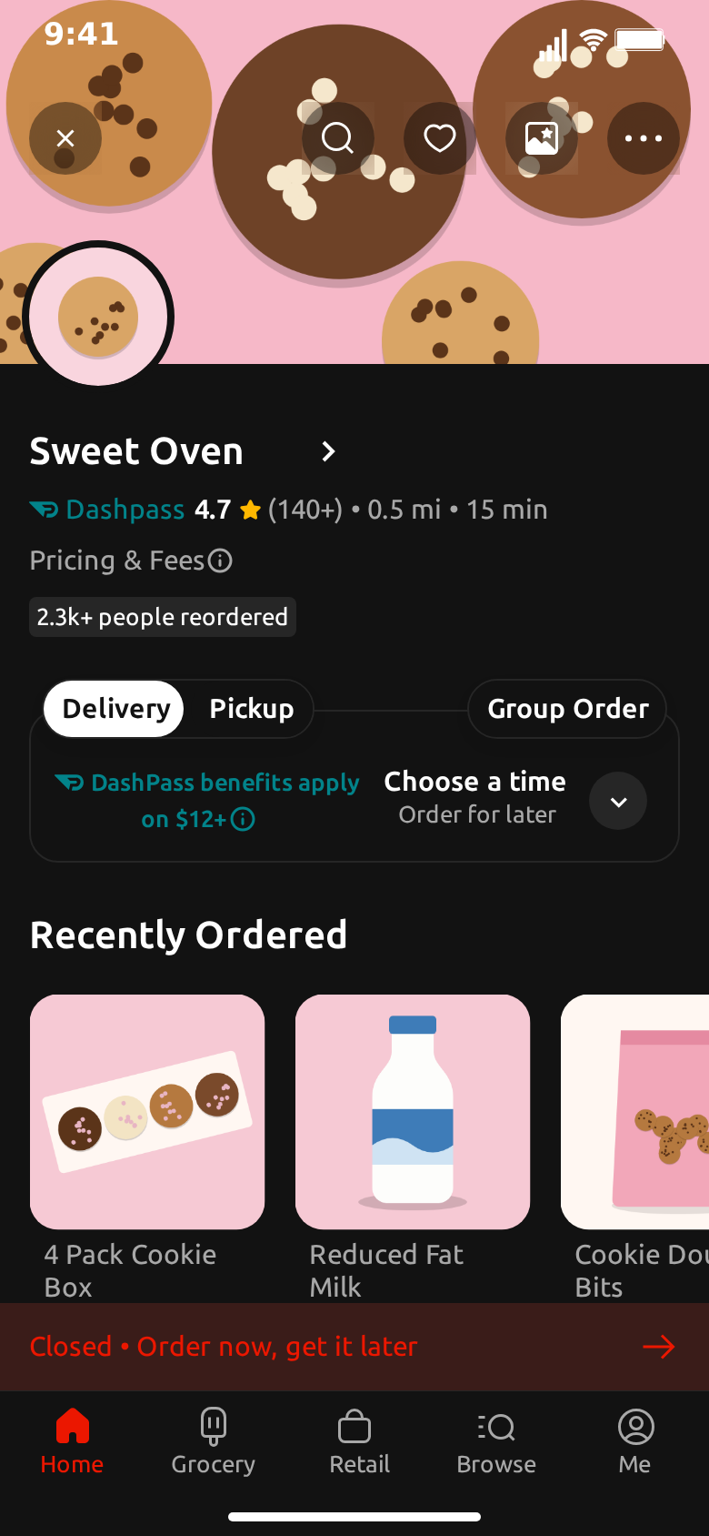
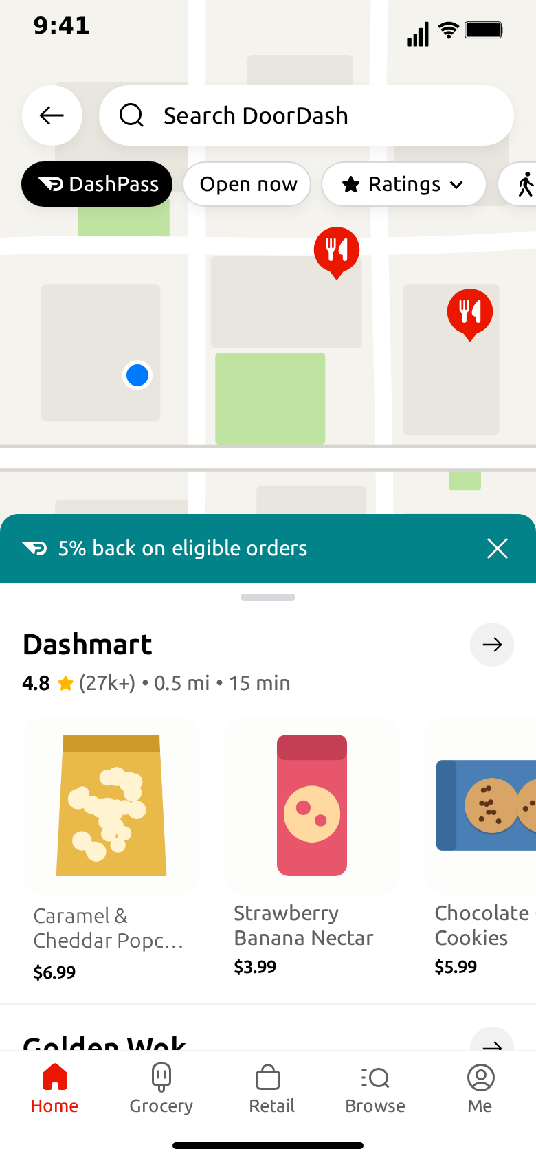
A note on what the template can do, so the ideas stay honest: it covers browsing, with the home screen, a store page and the Pickup map. There is no checkout or live tracking, so each idea below ends before the order does.
Skits
1. The 3am cart
The joke is the time of night and the number on the button.
- Stores. Two or three ordinary places, with one called something like "Regret Burgers".
- Cart. Label "VIEW CART", the store, count "12".
- Home script. Scroll slowly to the second row, pause a second, scroll back up.
- Flow. Home only, about six seconds.
Put the caption in your edit: "me saying I'm not hungry". The cart button stays on screen the whole time, so the viewer has six seconds to spot the 12.
2. Rating that does not add up
A store with a perfect score and a details line that explains why.
- Stores. One store rated 5.0, with details "(2) • 0.1 mi • 4 hr".
- Section. "Fastest near you".
- Flow. Home for five seconds, with a like on that store after a short pause.
The contrast between "Fastest near you" and "4 hr" does the work. Keep everything else on the screen normal, or the eye will not know where to land.
3. Your friend's cooking, as a store
Turn someone you know into a restaurant, with their permission.
- Stores. "Dave's Kitchen", rated 2.1, with the deal "Free smoke alarm test".
- Store page. Reorders "0 people reordered", notice "Closed • Dave is trying his best".
- Items. "Mystery Rice", "Rice (Burnt)", "Apology".
- Flow. Home, push into the store, hold three seconds.
Item names are where you can pile on the jokes, because the viewer has time to read them on the second watch.
4. The relationship status update
Section titles are free text, which makes them a place to hide a story.
- Sections. "Places we used to go", "Places she doesn't know about", "Places I eat alone now".
- Stores. Two ordinary invented stores in each.
- Home script. Scroll through all three rows, slowly, with a pause on each.
- Flow. Home only, about ten seconds.
The viewer reads the titles as they rise. It works without a caption, which is rare and worth using.
5. Budget by the end of the month
A two-part clip about a shrinking wallet, built from two exports.
- Clip one. Sections "Payday", stores with sushi and steak names and big deals.
- Clip two. Sections "The 29th", stores called "Cereal" and "Toast", details "(1) • 0 mi • 2 min".
- Flow. Home only in both, four seconds each.
Cut them back to back with a single hard cut. The second clip lands because the layout has not changed at all.
Local restaurants and food businesses
6. "Now open near you"
Show your new place the way customers would see it in an app, as a mockup for your own social post.
- Stores. Your place first, in a section called "New near you".
- Photo. A good shot of your best dish, cropped wide.
- Deal. Your real opening offer, if you have one.
- Store page. Your items and prices.
- Flow. Home, push into the store, hold three seconds.
Say what it is in the caption. A line like "imagine seeing us in your feed" keeps it clearly a concept. Don't suggest you are listed on a platform if you are not, and don't invent a rating or a review count: leave the rating empty and use the details line for your opening hours or your street.
7. Menu teaser
One new dish, presented like a recently ordered favorite.
- Store page. Your place, with the Recently Ordered row showing the new dish first.
- Notice. "Back this weekend only".
- Flow. Store only, about five seconds.
The notice band sits over the bottom of the row, so it reads as an announcement. Keep the name of the dish short enough to fit on two lines.
8. Pickup instead of delivery
If you want people to come to you, end the clip on the map.
- Map. An illustration of your block that you made or own.
- Promo. "10% off when you pick up".
- Sheet. Your place, with three items.
- Flow. Pickup map only, about five seconds.
Use your own art for the map. Screenshots of a real map service come with their own terms.
Demos and teaching
9. Design critique in a talk or course
Teach an interface pattern with a screen you can edit on the spot.
- Stores. Neutral, invented, with one store changed between two exports: a deal tag on, then off.
- Flow. Home only, with a scroll.
Play both versions and ask which store the audience would tap. Because every field is editable, you can test a label or a badge in seconds rather than asking someone to redraw the screen.
10. Pitch for a food app idea
Show your concept inside a familiar layout so people understand it immediately.
- Sections. Your feature as a row title, such as "Cooked by your neighbors".
- Stores. Examples of what would appear there.
- Flow. Home, push into a store, fade to the map.
For anything you show publicly, make clear it is a concept and not a product of the app it resembles. For a slide or an investor deck, a square export sits better on the page than a tall one.
How to make any of these land
A few things hold across all ten.
One detail per clip. The strongest of these change a single thing on an ordinary screen. If everything on the screen is a joke, none of it is.
Keep the store names plausible. A store that could exist makes the odd detail funnier than a store that is obviously a gag. Then let the rating, the time or the cart do the work.
Give the eye time. People read a screen in a set order: the title, the name, then the small print. A pause in the script before the moment that matters costs nothing and doubles the effect.
Trim the flow. Three screens is the default, not a requirement. Most of the ideas above use one or two.
Finish in the edit. The template gives you the screen. Captions, music and a reaction shot go in your video editor, and that is usually where the clip becomes yours.
Which screens each idea needs
Before you open the editor, decide which screens the clip uses. It saves filling in fields that never appear.
| Idea | Home | Store | Pickup map | What carries it |
|---|---|---|---|---|
| 1. The 3am cart | Yes | No | No | The count on the cart button |
| 2. Rating that does not add up | Yes | No | No | The details line |
| 3. Your friend's cooking | Yes | Yes | No | The item names |
| 4. Relationship status | Yes | No | No | The section titles |
| 5. End of the month | Yes (twice) | No | No | The hard cut between clips |
| 6. Now open near you | Yes | Yes | No | Your photo and your offer |
| 7. Menu teaser | No | Yes | No | The first item and the notice band |
| 8. Pickup instead of delivery | No | No | Yes | The promo band |
| 9. Design critique | Yes | No | No | One field changed between exports |
| 10. Pitch for an app idea | Yes | Yes | Yes | The section title naming your feature |
Half of the list uses Home alone, which is why it pays to get that screen right first. Set the address, the cart and the two or three rows, and you can reuse them across several clips by changing one field at a time.
Timing guide
Reading speed decides how long a clip should run, not the length of the idea. A rough guide for the default three-screen shape:
- Before the first scroll: about 0.7 seconds. The viewer needs a moment to recognize the app. Start moving any sooner and the first thing they see is motion, not a screen.
- On a row you want read: 1 to 1.5 seconds. A store's name and rating take about that long. A joke in the details line needs the longer end.
- On the store page: 2.5 to 3 seconds. There is more to read, and the eye starts at the top. If the punchline is in the items, add another second.
- On the last screen: at least 2 seconds. Viewers need time after the final beat, and a clip that cuts away as the point arrives feels rushed. It also gives your edit a place to hold a caption.
Watch the clip back with the sound off, once, without reading along. If you find yourself wanting to pause it, it needs a longer hold. If your attention drifts, cut a step.
Captions that help
The screen shows what happened, and the caption can say why it matters. The two should not repeat each other. A caption that says "me ordering at 3am" over a clip of a late-night cart is doing the screen's job. "I said one more episode" adds something, because the viewer connects the two themselves.
For local businesses it runs the other way: the caption should be plain. Say what the offer is, where you are and when it ends. People can scroll past a joke without losing anything, but they need these facts to act, and a clip that looks like an app can leave them unsure what is real. A line such as "concept video, we're at 12 Mill Street" removes the doubt.
Common mistakes
A few things go wrong often enough to check for before you export.
- Three stores in a row. Rows do not scroll sideways, so the third never appears. If it matters, give it its own section.
- A store page that does not match the card. The store page shows what you typed on its own tab, so a card called "Taco Town" can open on a page called "Sweet Oven" if you forget to change it.
- A name too long for the store page. About fourteen characters fit. Past that the name ends in an ellipsis, which can cut off the joke.
- Deals on every store. When every card has a red tag, none of them stands out. Use one or two.
- Scrolling away from the store you tap. The tap lands on the first store, so end the script at the top if the clip opens it.
Pair it with a chat
Since the template stops before the order arrives, a chat is the natural next beat. A clip of a store page followed by a message from the WhatsApp template ("are you seriously ordering again") tells a whole story in ten seconds. The iMessage template works the same way, and the prompt ideas post has more starting points for the conversation side.
Free to use. No sign-up. Browser-based.
Make a fake DoorDash videoFrequently Asked Questions
What makes a good food delivery video?
One idea, told in under fifteen seconds. Almost every clip here works because a single detail on the screen is the joke or the message: a rating, a time, a store name or the number on the cart.
Can a restaurant use this to promote itself?
Yes, as a mockup of what your place could look like, and it should be presented as one. Don't suggest you are listed somewhere you are not, and don't invent reviews or a rating and present them as real.
Can I show a real restaurant?
Use invented names. A made-up rating or a joke on a real restaurant's name is unfair to it and can get a clip taken down. The ideas here all use fictional stores.
Can these clips show the order arriving?
Not with this template alone. It covers browsing: the home screen, a store page and a pickup map. For the arrival, cut to real footage or to a chat from the WhatsApp or iMessage template.
How long should the clip be?
Most of these run eight to twelve seconds. The default clip is about ten. Trim the flow to the screens your idea needs, and hold the last one long enough to read.
Related Articles
How to Make a Fake DoorDash Video (Free, in Browser)
Step-by-step: build a fake DoorDash video in your browser, with store rows that scroll, a floating cart button, a store page and a pickup map. Exports MP4.
AI Fake Chat Video Generator: Describe It, Get the Clip
Type what the clip should be and MockClip's Describe it mode writes the messages and timing for WhatsApp, iMessage, ChatGPT, Tinder and more. Refine by second.