How to Make a Fake DoorDash Video (Free, in Browser)
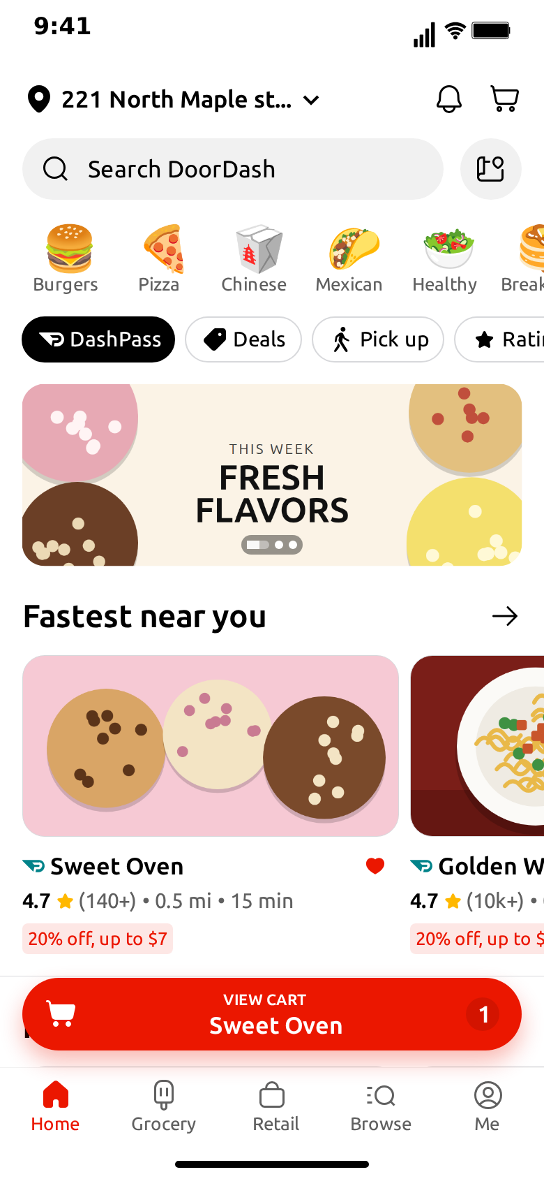
MockClip's DoorDash template turns stores you write into an animated phone screen that looks like a food delivery app on an iPhone. Rows of stores scroll under a fixed address bar, a red cart button floats over the feed, and a tap opens a store page before the clip fades to a pickup map. You export the result as an MP4 or a GIF.
This guide walks through the whole process, from the editor's default clip to an exported video. It takes about ten minutes the first time and a couple of minutes once you know where everything is. At the end there is a section on what the template does not draw, so you can plan around it before you start writing.
Every word and every photo in the clip is yours. Nothing is read from or sent to DoorDash, and MockClip is not affiliated with or endorsed by DoorDash, Inc. The screens follow a community design kit of the app, not every detail of the current release. Use invented store names, and keep the clip to skits, demos and creative work: don't use it to pass off a fake order, a fake store or a fake receipt as real.
What the template draws
Before you start, it helps to know which screens exist, because the video is built by arranging them in order.
- Home. An address line, a notification bell, a cart icon, the search bar, a row of food categories, filter chips and a promo banner. Under those sit the rows of stores, each with a section title and an arrow. A red View cart button floats above the tab bar.
- Store. A banner with round buttons on it, the store's logo in a circle, its name, a Dashpass line with the rating and details, Pricing & Fees, a reorder tag, the Delivery and Pickup toggle, a Group Order button, a time picker, a Recently Ordered row and a notice band above the tab bar.
- Pickup map. A map with restaurant pins and a blue location dot, a back button with a search bar, filter chips, a teal promo band, and a sheet that lists a store's rating and a row of its items.
Three screens is a small set, and that is the point. The whole clip is about ten seconds by default, which is the length that works for a joke or a quick demo. You can drop any screen from the flow, change how long each one holds, or reorder them.
Step 1: Open the template
Go to the DoorDash template. The editor loads with a working clip: six invented stores, a scripted scroll, the store page and the Pickup map. Press play once before you change anything. Watching the default gives you a feel for the pacing, and every field you are about to edit is already filled with an example you can overwrite.
The editor has a tab for each screen. Switching tabs moves the paused preview to that screen, so you can see what you are editing.
Step 2: Add your stores
The Home tab holds the list of stores. Each one has these fields.
- Store. The name on the card. Invent one. A short name reads best, because a long one is cut with an ellipsis before the heart.
- Section. The title of the row this store sits in, such as "Fastest near you". Stores next to each other in the list with the same section share one row.
- Rating. The bold number with the star, such as 4.7. Leave it empty and the star goes too.
- Details. The grey line, usually reviews, distance and time: "(10k+) • 0.5 mi • 15 min".
- Deal. The red tag under the details, such as "20% off, up to $7". Leave it empty to hide the tag. A row with no deal at all is drawn a little shorter, the way the design does it.
- Member badge. The small teal badge before the name.
- Liked. Starts the store with a filled red heart.
- Photo. The wide image on the card. Without an upload the card shows a neutral illustration from the default clip, or a plain grey block for a store you added yourself.
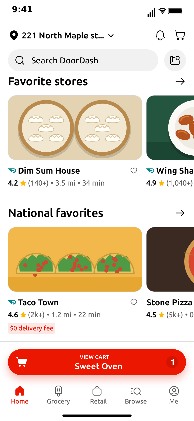
Rows are the part worth a moment of thought. A row runs off the right edge of the phone, so the first store is fully visible and the second is cut. The rows scroll up and down, not sideways, so a third store in a section will not appear at all. Two stores per section is the practical rule, with the one you care about first.
A store with an empty section joins the row above it, which saves typing. A store with a new section starts a new row.
Step 3: Script the home screen
Under the stores is What happens on this screen. This is a short list of steps that play in order while Home is on screen.
- Scroll moves the feed to a store's row, to the top or to the bottom.
- Like pops the heart on a store and turns it red.
- Pause waits before the next step.
The default script scrolls down to the favorites and comes back, which ends on the first store just before the tap into it. Keep that shape if your clip opens a store, because the tap lands on the first store's photo and it looks wrong if the feed has moved past it.
A pause before a like matters more than it sounds. Without one, the heart pops while the eye is still following the scroll, and the moment is lost.
Step 4: Set the address, cart and banner
Below the script are the small fields that make the screen feel lived in.
- Location. The address at the top. Use an invented one. It looks most natural cut off with three dots, as the app does.
- Cart. The label on the red button, the store under it and the number in the badge. Change the count to 12 for a joke, or match the store to the one the clip opens.
- Promo. The banner image under the chips. The default is a plain illustration; upload your own to advertise your own idea.
The cart button stays pinned while the feed scrolls under it, so whatever you write there is on screen for the whole of Home.
Step 5: Fill in the store page
The Store tab holds the page the clip opens.
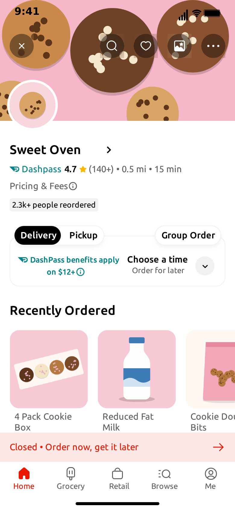
- Banner and logo. The photo across the top and the round image over it.
- Name. Up to about fourteen characters fit before the arrow. Longer names end in an ellipsis.
- Rating and meta. The same values as the store's card, so the tap feels like opening that store.
- Reorders. The small grey tag, such as "2.3k+ people reordered". The tag grows to fit what you write.
- Notice. The band above the tab bar, such as "Closed • Order now, get it later". It sits over the bottom of the Recently Ordered row, and it covers the prices there, as the design does.
- Items. The Recently Ordered row: a name, a price and a square photo for each. Names wrap onto two lines.
The store page does not follow the tap by itself. It shows what you type on this tab, so copy the first store's name, rating and details across. This is the one place in the template that is easy to forget.
Step 6: Fill in the Pickup map
The Pickup tab holds the last screen of the default clip.
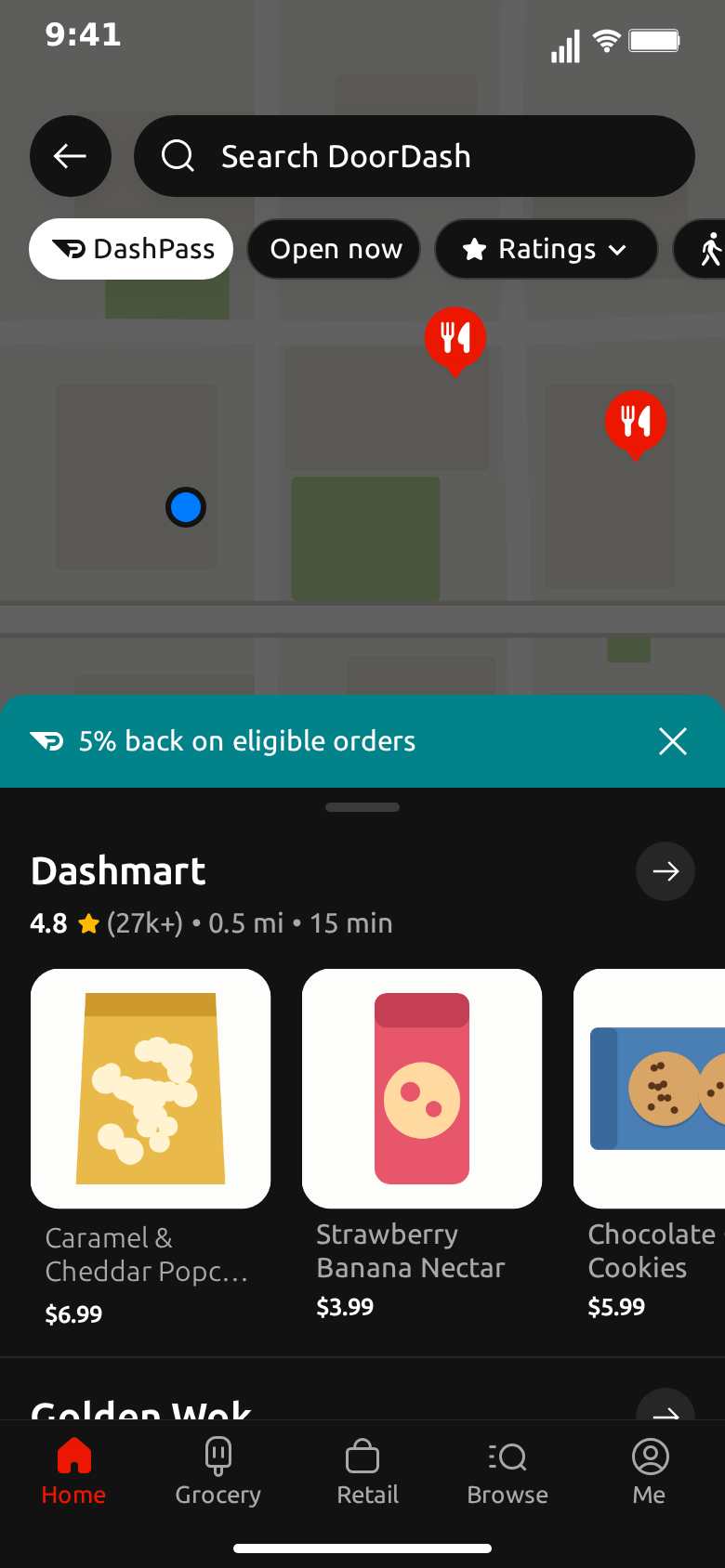
- Map. The image behind everything. The default is an invented street grid with no names on it. If you upload your own, use something you have the right to use. In the dark theme the map is dimmed so the status bar stays readable.
- Promo. The teal band, such as "5% back on eligible orders".
- Store, rating, meta. The heading of the sheet.
- Items. The row of products under it.
- Next store. The name peeking above the tab bar.
Step 7: Arrange the video flow
Video flow decides which screens appear, in what order, how they change and how long each holds. The default is Home, a push into the store, then a fade to the Pickup map.
Two changes come up often. For a clip that is only about the feed, remove the other two steps and lengthen the hold on Home so the script has room to finish. For a clip that is only about a store, start on Store and drop the rest.
Turn touch indicators on if you want the viewer to see where the tap lands. It helps the transition make sense, and it is the difference between a screen that changes and a person using an app.
Step 8: Choose a theme and export
Pick light or dark. Both themes cover all three screens, so this is a matter of taste and of what sits around the clip in your edit. Then choose a format: vertical 9:16 for TikTok, Reels and Shorts, or a 1:1 square for feed posts. Export an MP4 or a GIF, with or without the iPhone bezel. Free exports carry a watermark, which paid plans remove.
Skip the typing with Describe it
If you would rather not fill every field by hand, use Describe it, the AI panel at the top of the editor. Write one sentence about the clip you want, such as "I scroll past a few stores, open a cookie place and check the pickup map", and it drafts the stores, the script and the flow for you to adjust. It needs a sign-in. The guide to Describe it covers how to get good results from it.
What the template does not do
It is better to know this now than halfway through an edit.
- No checkout, payment or order confirmation. The clip stops at browsing. There is no basket screen, even though the cart button is there.
- No order tracking. There is no driver, no map with a moving car and no "your order is on the way" screen.
- No sideways scrolling. A row shows its first store and part of the second.
- No item page. A tap on a menu item does not open anything.
- The store page does not follow the tap. Whatever the clip opens, the Store tab decides what it shows.
If your idea needs a conversation, such as a customer arguing with a driver, the WhatsApp template or the iMessage template will do that part, and you can cut the two clips together. For a banner that slides in on a lock screen, the iMessage notification template is closer.
Using it responsibly
A clip that looks like an app can be mistaken for a real screenshot, so a few habits are worth keeping. Use invented stores rather than real ones, since a made-up rating on a real restaurant is unfair to it. Don't use the clip to claim an order, a refund or a delivery that never happened. If it is an ad for your own business, say that it is a mockup. The template page says the same in its FAQ.
For ideas on what to make with it, see ten food delivery video ideas.
Free to use. No sign-up. Browser-based.
Make a fake DoorDash videoFrequently Asked Questions
How do I make a fake DoorDash video?
Open MockClip's DoorDash template, add your stores with a name, a rating, a details line, a deal and a photo, give each one a section, add script steps such as Scroll and Like, fill in the store page and the Pickup map, arrange the screens in Video flow and export an MP4 or GIF.
Is this connected to DoorDash?
No. Every store, price and photo is something you type or upload in the editor. Nothing is read from or sent to DoorDash, and MockClip is not affiliated with or endorsed by DoorDash, Inc.
Does the template show checkout or order tracking?
No. The template covers browsing: the home screen, a store page and the Pickup map. There is no checkout, no payment, no order confirmation and no live tracking screen.
Can I use my own photos?
Yes. Each store has a Photo upload, and the promo banner, the store page's banner and logo, the item photos and the map are all image fields you can replace. Without an upload the editor shows neutral food illustrations.
Why do only two stores show in a row?
A row runs off the right edge of the phone, as it does in a delivery app, so the first store and part of the second are on screen. Rows scroll up and down, not sideways, so put the stores that matter first in each section.
Do I need an account?
Not for the manual editor. Describe it, the AI panel that drafts stores and a flow from one sentence, needs a sign-in to MockClip.
Which formats can I export?
MP4 or GIF, with or without the iPhone bezel. Vertical 9:16 suits TikTok, Reels and Shorts, and a 1:1 square crop suits feed posts. Free exports carry a watermark, which paid plans remove.
Related Articles
10 Food Delivery Video Ideas With a Fake DoorDash Screen
Ten food delivery video ideas for skits, local restaurants and app demos, with the stores, the script and the flow to build each one in a fake DoorDash screen.
AI Fake Chat Video Generator: Describe It, Get the Clip
Type what the clip should be and MockClip's Describe it mode writes the messages and timing for WhatsApp, iMessage, ChatGPT, Tinder and more. Refine by second.