Stripe Payment Notification Videos: 6 TikTok Ideas
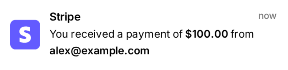
A "You received a payment" banner is one of the most recognisable images in creator and founder content. Viewers read it in a fraction of a second, and they know what it means. That makes it an efficient hook, and a flexible one: the same banner can open a launch vlog, land a joke about a late invoice, set up a story about a slow quarter or show a product ad's audience that people actually pay for the thing.
Below are six ideas you can build with MockClip's Stripe notification template, each with a banner script, the timing that makes it work and a few variations. You write every payment yourself, so the numbers are whatever your story needs. Just keep them honest when real money is implied: that point comes up again at the end, because it is the difference between a good video and a misleading one.
All amounts in this post are illustrative examples, not payments to a real account.
Why the format works
Three things make notification videos efficient on TikTok, Reels and Shorts.
Instant recognition. The purple "S", the bold "Stripe" and the payment line with its bold amount are familiar to anyone who has sold anything online. Viewers understand the setup before they finish reading, which saves the first second, the one that decides whether they keep watching.
A built-in rhythm. In MockClip, banners arrive one at a time. Each one slides down from the top, stays for its on-screen time and leaves before the next arrives. That turns a list of payments into a sequence of beats, and you control every gap between them.
An audible cue. Each banner plays a short chime as it arrives. Even with the screen half-watched, the chime tells viewers something just happened.
Before you start: the template in one minute
Each banner has a Title (bold, "Stripe" by default), a Time on the right ("now" by default, any text), and a Message underneath that wraps onto up to four lines. Double asterisks around any words draw them bold, which is how the amount and the payer stand out: "You received a payment of $100.00 from alex@example.com". Every banner has its own Delay (half a second by default) and On screen time (four seconds by default), and leaves by sliding up or fading. The background can be an iPhone lock screen, a flat theme colour, a chroma-key green, your own image, or transparent for overlays.
The full walkthrough of every field is in the Stripe notification video maker guide. The ideas below assume you have the template open.
1. The first client
Hook: a phone on a lock screen, nothing happening, then one banner.
Banner script:
- Delay: 1.5 s
- Title: "Stripe"
- Time: "now"
- Message: "You received a payment of $450.00 from lena@example.com"
- On screen: 4 s, leaves by fading
Keep the first second and a half empty so viewers wait with you. Set the lock screen clock to the moment the story happens: 11:48 at night works well, because a late first payment feels earned. Then cut to your reaction, to the invoice on your laptop, or to the first line of the thank-you email.
This is the most relatable version of the format, because every freelancer and founder remembers it. It works best with your real first payment: recreate the actual amount, and the video becomes a small piece of your business's story rather than a stock clip.
Variations: the first subscriber of a SaaS, the first sale of a course, the first client from a new country. The banner stays the same; the caption carries the context.
2. Launch-day rush
Hook: "I launched at 9 AM. Here's the first ten minutes."
Banner script: six banners, each with:
- Delay: 0.4 s
- On screen: 2 s, leaves by sliding up
- Amounts that go up and down: $29.00, $79.00, $29.00, $149.00, $29.00, $299.00 (illustrative: a launch with three price tiers)
- A different payer on each banner, and "now" on all of them, or "9:01 AM", "9:03 AM", "9:04 AM" written into the time field
Short delays and short on-screen times make the payments feel like they are pouring in, without the screen ever filling up. Set the lock screen clock to the launch time so the first frame tells viewers when the story starts. End on your face, the launch tweet, or the dashboard.
If the launch was real, use the real payments, even if there were three instead of six. A modest, honest launch video often lands better than an implausible one, because viewers who sell online can tell.
Variations: a Product Hunt day, a Black Friday opening, the hour after a creator posted about the product.
3. The slow month and the payout
Hook: "Day 1 of zero payments."
Structure: captions count the days over a lock screen with no banner at all. Day 2, day 5, day 9. Then one payment arrives, and the clip ends on a payout.
Banner script for the payoff:
- Delay: 2 s (the pause is the joke)
- Message: "You received a payment of $2,400.00 from Acme Ltd"
- On screen: 3 s, then a second banner after 0.8 s: "A payout of $2,352.00 is on its way to your bank account"
- On screen: 4 s
The payout line is the natural ending of a payments story, because it turns the numbers into money that reaches you. You can also play the format for comedy instead: the long-awaited payment turns out to be $3.50.
To film the empty days, export a short lock screen clip with a long delay before the only banner, or a theme-colour clip, and trim it in your editor. Changing the date line between clips helps the day-count read clearly.
4. The invoice that finally got paid
Hook: a banner that is not what the viewer expects.
The title and message are free text, so the banner can carry a joke. Some directions:
- "Acme Ltd paid invoice #1042 for $600.00", followed by a caption: "sent in March."
- A payment of $0.01 from a client testing whether the link works.
- A payment arriving at 3:12 AM (set the time field and the lock screen clock), followed by you staring at the ceiling.
- A message that runs past four lines, so the ellipsis cuts it off right before the amount.
Keep it short: two or three banners, then the reaction. Comedy versions are clearly skits, so there is no implied financial claim, but avoid using a real client's name or details.
Banner timing: delay 0.8 s, on screen 3 s. The reaction shot should start as the last banner leaves.
5. Behind the work
Hook: the banner over footage of the work.
Export the banners with a transparent background (MOV or WebM) or on the chroma-key green, then place one over each scene of you doing the work the payment is for: the design being finished, the code being pushed, the session being recorded, the package being sealed. One banner per scene change ties each step to a payment without saying a word.
Transparent export draws only the banner, with no status bar or home indicator, so it sits cleanly on top of any footage, and the translucent card picks up a little of the scene behind it. The transparent notification video guide explains which editors read MOV and WebM alpha. If your editor only does chroma key, the green screen iPhone notification guide covers keying settings. Pick a different chroma colour if your footage has green in it.
Banner timing: export each banner as its own short clip (one banner per export), or one clip with long delays and trim it into pieces.
6. An honest ad hook
Hook: a chime and a banner in the first second of an ad.
For a product, a template or a course, the banner says "people pay for this" faster than any caption. Put a single banner over the first shot of the product, then move into the actual pitch: what it is, what it does, why it is better.
Keep it truthful:
- Use your real payment lines where you can.
- If the numbers are illustrative, mark them clearly: "illustrative" in the caption or a small on-screen note.
- Never pair invented amounts with income claims, course pitches or "I made this much in a week" framing. That is the line between an ad and a scam.
A useful alternative is a banner that carries no amount at all. A message like "Acme Ltd started a subscription" or "New customer: studio@example.com" shows activity without implying a revenue figure.
Timing cheat sheet
| Goal | Delay before each banner | On screen |
|---|---|---|
| A single, important payment | 1–1.5 s | 3–4 s |
| A steady stream | 0.6–1 s | 2–3 s |
| A rush | 0.3–0.5 s | 2 s |
| A dramatic pause | 1.5 s or more | 4 s |
Banners arrive one at a time: each leaves (sliding up or fading) before the next comes in, so a rush feels fast without the screen filling up. Sliding up suits rushes, because each exit points toward the next arrival. Fading suits single, important banners, because it lets the moment linger.
A rough guide for reading time: a one-line message needs about two seconds on screen, a four-line message closer to four. When in doubt, watch the preview on your phone at full size and see whether you can read every banner without pausing.
Choosing the background for each idea
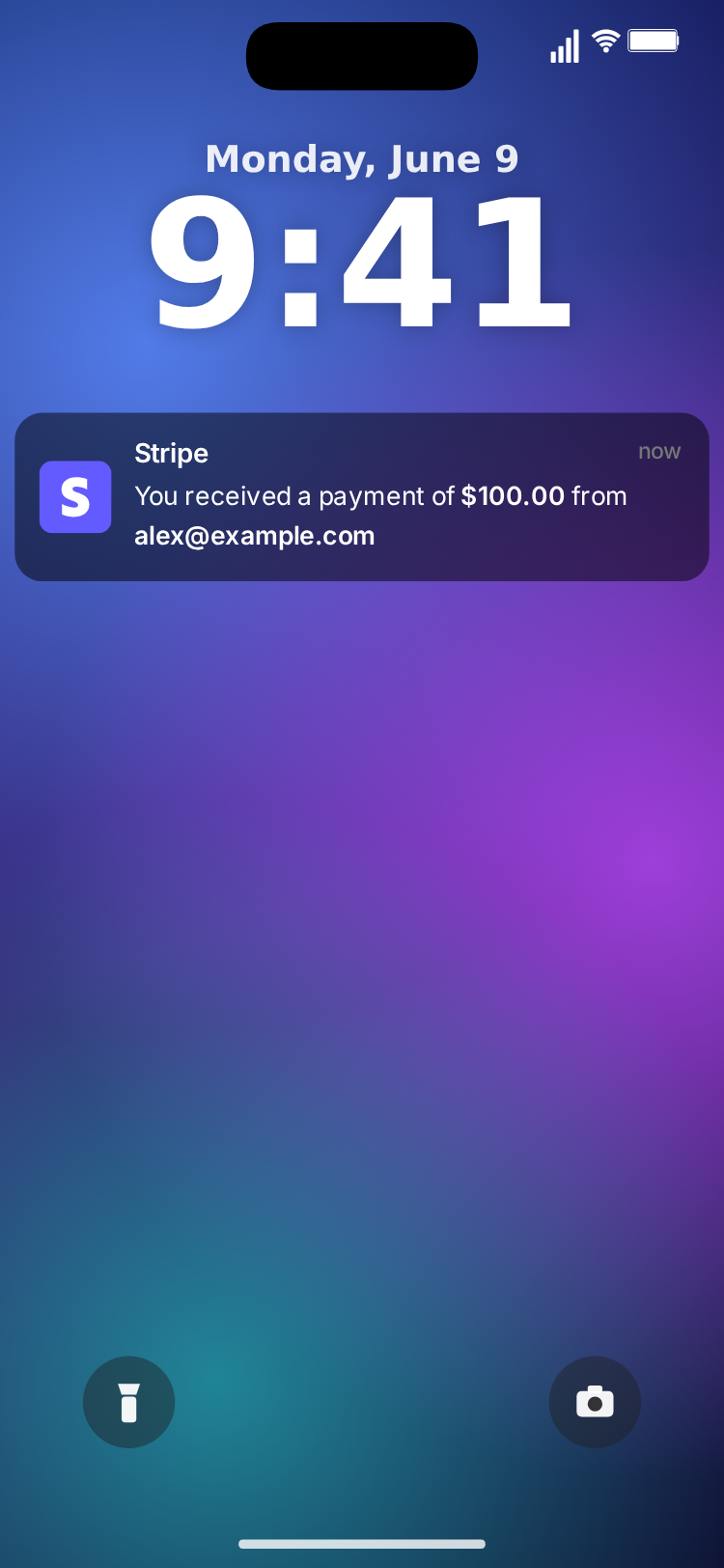
- Lock screen for ideas 1, 2 and 3. The editable clock and date line carry part of the story: the launch time, the late night, the day count. Pick a gradient wallpaper or upload your own photo.
- Transparent or chroma key for ideas 5 and 6, where the banner sits over your own footage.
- Theme colour for quick tests, or when the clip will sit inside a larger edit with its own design.
- Custom image when you want a specific photo behind the banners, such as your desk or your product.
Theme: dark banners read best on bright wallpapers and footage; light banners on dark ones. Try both in the preview before exporting.
Turning one idea into a series
A single good clip can become a format. Some series that suit payment banners:
- "Every payment this week": one episode per day, with the real payments from that day. Honest numbers make this one work.
- "Building in public": a banner opens each update, then the week's progress follows.
- "Freelancer problems": a recurring skit where every banner is a small disaster (an invoice paid in the wrong currency, a refund request a minute after the payment).
Keep the same wallpaper, theme and timing across episodes so returning viewers recognise the format instantly.
Sound, captions and editing
Each banner plays a short chime as it arrives. Leave it on for a clear beat per payment, or switch off Sound Effects and add your own audio, music or voiceover in your editor. If you want a specific notification sound, use one you have the rights to; MockClip does not include Stripe's.
Captions do much of the storytelling in these videos. The banner shows what happened; the caption says why it matters ("first payment after 47 days", "this one paid for the new laptop"). Place captions above or below the banner area so they never cover the payment line.
Export settings
- Format: vertical 9:16 MP4 for TikTok, Reels and Shorts. GIF for presentations or websites. MOV (ProRes 4444) or WebM (VP9) for transparent overlays; MP4 and GIF fill the transparent area with the theme colour.
- Square: a 1:1 crop for feed posts and carousels.
- Size: 720p or Full HD.
- Plans: MockClip is free to try in the browser. Watermark removal and some export options depend on the plan; see pricing.
Drafting with Describe it
If you would rather start from a draft, switch to Describe it and type one sentence: "a freelancer's first three Stripe payments on launch day", "a SaaS gets nothing for a week and then a yearly plan", or "five payments in a row at 3 AM, then a payout". MockClip drafts the banners, the payment lines with the amounts in bold, and the timing for you to edit. It needs a Google or GitHub sign-in. Check the numbers it writes, and change them to your real payments if the video is about your business.
Mistakes to avoid
Every banner the same. Identical amounts and payers look like a loop. Vary them.
Too many banners. Six banners at default timing already make a clip of nearly half a minute. For a rush, shorten the delays and on-screen times instead of adding payments.
Unreadable timing. A long message on screen for two seconds is wasted. Shorten the text or give it more time.
Implied income from invented payments. A skit is a skit. A video that suggests "this is my revenue" should use real payments, and invented amounts should never support an income claim or a course pitch.
Other notification formats
The same one-at-a-time banner rhythm works for orders and for messages from people. The Shopify notification template shows "New order" banners for a store; the six Shopify notification video ideas translate directly to payments. The iMessage notification template drops texts onto the lock screen with the same delay and on-screen controls. Mixing the two in an edit, a payment banner followed by a text from a friend, makes a natural two-beat story.
MockClip is an independent tool and is not affiliated with or endorsed by Stripe, Inc. The banners are drawn by MockClip and never connect to a real account, payment or login.
Free to use. No sign-up. Browser-based.
Make a Stripe notification videoFrequently Asked Questions
How long should a Stripe notification video be?
Most work in 8 to 20 seconds: a hook in the first second, three to six banners, and a payoff. Banners of 2 to 3 seconds with half-second to one-second delays read comfortably on a phone.
What format should I export for TikTok and Reels?
Vertical 9:16 MP4 from MockClip. If you want to place the banner over your own footage instead, export a transparent MOV or WebM, or use the chroma-key background.
Can I show real numbers from my business?
Yes, you type every title, payment line and amount yourself, so you can recreate real payments. If the numbers are illustrative, say so on screen or in the caption.
Is it allowed to post fake Stripe notifications?
Skits, reenactments and clearly illustrative ads are common. Do not present invented payments as real revenue, and keep the clips away from income claims; MockClip is not affiliated with Stripe.
Related Articles
Fake Stripe Notification Video Maker: Payment Banners
Make a Stripe payment notification video: "You received a payment" banners with a bold amount sliding in on an iPhone lock screen, with transparent export.
Shopify "New Order" Notification Videos: 6 TikTok Ideas
Six short-video ideas built on Shopify "New order" notifications: the first sale, a launch-day rush, slow-week twists and honest ad hooks, with timing.
Transparent Notification Video: MOV and WebM Alpha Export
Export iMessage and phone call notification videos with a real alpha channel as ProRes 4444 MOV or VP9 WebM. Drop them on any footage, no green screen to key.
Green Screen iPhone Notification Videos (Chroma Key Ready)
Export iPhone text and call notifications on a pure green background — ready to chroma key over any footage in CapCut, Premiere, or DaVinci.